Once again, we hope this Quarterly Update finds our readers healthy and looking forward to a fresh start to 2021. We continue to be optimistic about the future with the gradual but accelerating release of the COVID-19 vaccines, coupled with signs of a recovery percolating across various industry sectors. As in past reports we present a Table of Contents and Summary below to assist time constrained readers with navigating to their preferred section or getting a quick general take.
To wind up our Q4-2020, you, our investors, have continued to ask for insights on the impact COVID-19 has had on our portfolio as well as office-use in general. Our existing portfolio has witnessed a steady return of office users and the resulting increase in office utilization since the peak of lockdowns; no new news since last quarter. In the Q3-2020 report we highlighted the future of office-use over the long-term, and if it will ever return to pre-COVID levels (yes, we believe so). Over the last 90+ days we have continued to stay attuned to various real estate brokerage houses, investment banking firms, architects, consultants, and survey materials regarding the impacts of COVID-19 on the real estate sector. One third party, Cushman Wakefield, has done an excellent job of analyzing and formulating sound opinions and forecasts through various surveys, research and data sets regarding the return of office.
To recap, a few brief takeaways in our opinion since the pandemic began and the effects on the office worker and the built environment:
These takeaways have various dynamics which when combined will impact future office-use. In particular, the occupation of an employee or the industry sector of an office-using business are significant in determining office utilization. Our view is that businesses will continue to need office space as mentioned last quarter, and they will use roughly similar amounts compared to pre-COVID levels, though the way they utilize this space will be altered. What has not yet evolved with clarity are the specific changes that will be needed and how quickly these changes will come about. We will continue to focus on serving the needs of our customers (tenants) as they adapt and will do our best to match our office space offerings within the portfolio to their required adaptions.
A key question for us as owners of real estate - why do businesses need office space and what as owners should we focus on to maintain tenancy? The answer to this question is changing. Historically the top reasons businesses required office space were: A) for management teams overseeing their employees and encouraging productivity, B) access to workplace amenities (fitness centers, tenant lounge, etc..) to provide one-stop-shop convenience for employees thereby increasing productivity, C) office designs which helped foster company culture, and D) high-end office space to help attract the best talent. These reasons will remain key drivers, but each will be altered in some capacity moving forward balancing culture, productivity and location. We will break down two key components of office space, productivity and culture, because in our view these two items are essential for office using businesses. With the impacts of COVID we continue to watch intently how these two core attributes drive office occupier requirements and how we can assist our customers in achieving an optimal balance.
Productivity: Various reports have commented on the surprising outcome of how remote work has performed during COVID-19. Cushman & Wakefield’s report, New Perspective: From Pandemic to Performance, highlights a study recently completed by McKinsey which found that 41% of employees believe they are “more productive” at home and 28% believe they are “as productive.” While many employees feel they are as or more productive at home, there is a question as to how sustainable productivity will be in the remote work environment. Several noticeable issues have arisen via the WFH experiment, those include virtual meeting over-load contributing to a lack of productivity, decreased collaboration and innovation amongst teams, and an old term “Fear of Missing Out” or FOMO has now weaved its way into the real estate lexicon. All these issues are solvable by returning to the built environment (at near pre-COVID levels). As stated in past reports we believe office demand will revert to the mean with employers offering their employees a hybrid schedule of WFH and being in the office so FOMO doesn’t occur! To further support this likely outcome in the U.S. per Cushman & Wakefield: New Perspective: From Pandemic to Performance “….an owner with locations in China and Korea noted that, as of October 2020, businesses were back to in the office at pre-pandemic levels, adding they expected similar results across other markets once the virus’ spread is under control.” To boot, several large corporate users of office space agree their productivity has decreased and businesses are feeling the impacts of WFH. For example, several prominent company CEO’s including JP Morgan Chase, Netflix, Cisco, Goldman Sachs, and Walmart have clearly stated in various articles and press releases the need for their employees to come back to the office.
To help us further determine in real time what is happening with the WFH experiment in our own portfolio, we can now analyze and assure our customers of the best service by checking usability across each asset, City, and/or State in which we own.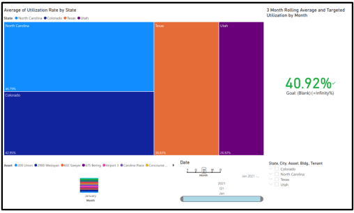 The graphic herein is our first “beta” test of our portfolio to understand our utilization rates across four states. The data shows an increase of utilization rate to just over 40% as of January 2021, a substantial increase from 25%+ in Q2-20. We are continuing to refine this data from each property into our BI (business intelligence) system, which we call Griffin Essential. This table is not 100% precise as it only samples a portion of our portfolio. As we say to our broker friends “take everything with a grain of salt”, but the point illustrated remains valid, utilization is slowing trending back to the mean as anticipated.
Culture: Peter Drucker said, “culture eats strategy for breakfast.” For many businesses, the impact on culture is one of the largest concerns for employees working remotely. In a survey done by Cushman & Wakefield, 50% of employees struggled to feel connected to their company and coworkers while working remotely during COVID. This lack of connection could potentially lead to difficulty retaining employees. The disruption of culture from working remotely is also susceptible to a snowball effect, especially given working remotely makes it easier for employees to move companies. The cycle would go something like the following – remote work leads to a lack of culture, lack of culture leads to employees leaving (which is easier when working remotely), employees leaving leads to lack of culture, and on and on.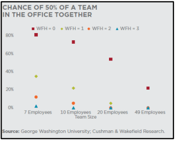
The human interaction side of a business is also key for employee development. Per a George Washington University analysis (see graphic nearby), even light WFH policies of 1 day a week significantly change the number of times teams will interact in person. For example, if a team of 20 employees each WFH two days per week then there is less than a 10% chance of more than 50% of the team being in the office together on any given day. This is a problem if your business is built on collaboration, innovation, and communication amongst the team. Further, as illustrated in the bar chart below, if two employees work remotely only 1.5 days a week, the chance of both being in the office at the same time are 41%, versus 88% if there are no WFH days per week.
So, what does all this mean for a business trying to maintain a “Culture?” The conclusions from a series of recent reports we have continued to reference herein (Cushman & Wakefield: New Perspective: From Pandemic to Performance) include the following:
These bulleted items above point to the conclusion that office owners and their tenants will do their best to maintain productivity and culture within their office environments, and we as office owners will see the following occur:
What is Risk and How does an Investor Quantify it?
When real estate sponsors talk about investment offerings, most often they mention the phrase “strong risk adjusted returns.” Well, what does that really mean? According to Investopedia.com, “A risk-adjusted return is a calculation of the profit or potential profit from an investment that considers the degree of risk that must be accepted to achieve it. The risk is measured in comparison to that of a virtually risk-free investment – typically versus U.S. Treasuries….” So, when we or sponsors like us, mention overall risk adjusted returns, we are generally referring to an Equity Risk Premium. This calculation usually references equity investing in the stock market, but this can be applied to any type of equity investment. The next several pages we will summarize how we quantify risk for each of our investments with an internally developed “Confidence Score” which assists the TEAM in determining each asset’s allowable “equity risk premium” or, as we typically state, is the best “risk adjusted return” for a particular investment.
As part of each investment review process, either newly acquired, developed, or existing assets, we make every effort to quantify risk. As part of our investment and due diligence process, we take several factors into account. Over the last year while prepping for the launch of our latest investment fund and while COVID-19 was allowing us some “free time” during a choppy capital market period, we further refined our system to thoroughly quantify and catalogue the risk score of each of our current investments and potential future investments. We can then compare this “Confidence Score” to our underwritten returns. Further, upon realization of our investments, we can compare actual returns to the perceived risks at acquisition and use this data to continually hone our understanding of different risk factors. These evaluations are one of the tools in our toolbox used to determine the type of investment opportunity presented by each asset’s investment profile, such as a core, core plus, value add, opportunistic. Once the investment opportunity profile is determined it allows us to set general expectations on pricing and overall risk and return synopsis. The first step in the process to create the “Confidence Score” is to determine what risks private real estate investments face. We broke these risks into three categories; External Risks, Internal Risks, and Financing Risks summarized over the next few pages.
One final item to note within our risk assessment system, Griffin quantifies investment risk in an inverse fashion. For example, instead of saying something is “high risk,” our criteria would state the investment has a “low Confidence Score,” and, conversely, for a “low risk” investment, Griffin would say that the investment demonstrates a “high Confidence Score.”
The following provides more details on each “Risk” and several key factors and methodologies we apply to formulate our Confidence Score. This is not intended to cover ALL the items we review.
The first step is to assess external market risk. External risk is market and possible systemic risks facing the overall location. These risks include items such as historical market and submarket real estate fundamental performance, market cycle timing, forward rent growth projections, historical occupancy and rental rate performance, as well as overall walk and transit scores related to the investment location.
Assessing market risk requires determining where each market is within the real estate cycle and, more specifically, how the submarket containing the potential investment is currently performing with respect to its historical performance. This enables the Acquisition Team to make well informed projections on the future performance of the market and submarket. As mentioned above, the first step is determining where the macro market falls within the real estate cycle; we do this semi-annually by assessing Real Estate macroeconomic data compiled by the research departments of major brokerage houses and data aggregators. We collect and analyze this data to create a “House View” on where each market finds itself in the real estate cycle, which is conveniently referred to as the “property clock.” The property clock below is an example of where a market sits within the real estate cycle.
Upon completing the market review, we evaluate historical trends in rent and occupancy at both the asset and the submarket level.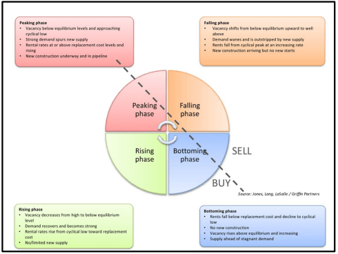 The historical evaluation of rent and occupancy is a key component to External Risks, and you’ve likely heard one of us mention the following in regard to a potential investment “…is there intrinsic demand for this asset?” The upshot to this important historical analysis is how the asset has performed versus its peers, has the asset shown a declining occupancy trendline and does the asset provide a strong peak to peak rent growth trend line. If both occupancy and rent have trended flat or negative, there is no valid reason in our opinion to proceed with the investment, unless something functionally or demographically we have uncovered could change tenant demand (occupancy) and rents.
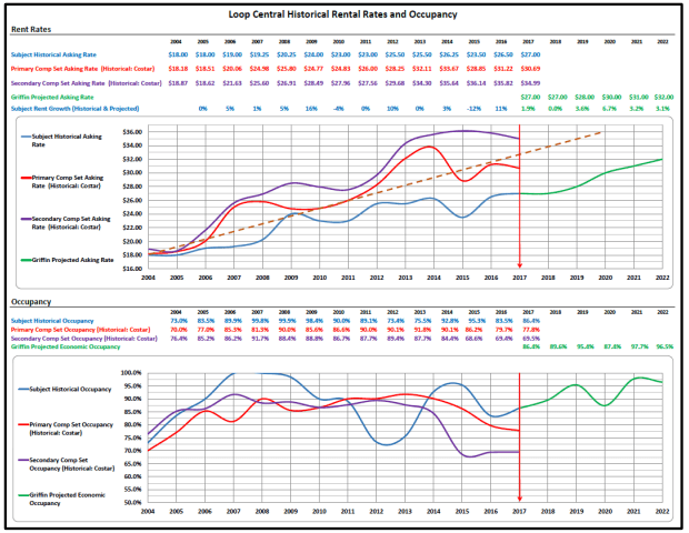
The two example graphs below assist in this determination of intrinsic demand displaying peak-to-peak rental rate and occupancy trends of an asset. The data points in these two graphs tell us that there is intrinsic demand for the asset as both peak-to-peak rent growth and strong historical occupancy compared to its peers are upward or positive in trajectory. The graphic below is Loop Central in Houston, and the takeaways are the asset averaged 89% occupancy over 12+ years although it underperformed its peers in rents (a sign we can add value). Further, the peak-to-peak rent growth is evident in its upward trajectory (average dotted line on top graph). These two metrics are evidence to us of intrinsic demand and also that the property is a value alternative for its occupants and therefore an opportunity for us to create additional value.
One other aspect Griffin finds worthy of strong consideration, especially as it relates to external investment risk, is the Walk and Transit Scores (click here). These scores determine how accessible the building is and its proximity to appealing amenities such as restaurants, parks, transit stops, apartments, and others. A higher score means the asset is “ideally located,” and, thus, the investment possesses diminished locational risk. The combined assessment of these risk attributes allows Griffin to quantify the amount of location risk each investment possesses and, thus, the amount of location risk that Griffin is onboarding into its portfolio.
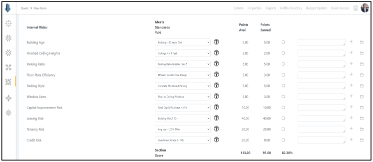
The second prong of our risk assessment quantifies risks specific to the functionality, operations, and future cash flow of the particular property. Internal Risks are items such as the physical building, current capital and repair and maintenance performance, as well as the existing rent roll. For example, these primary base building items include the building’s age, ceiling heights, window systems, parking ratios, and other investment specific risks related to the rent roll such as weighted average lease term (WALT), tenant size, tenant concentration, and tenancy credit. Another key component of the internal risk factors is dissecting the rent roll.
We spend a fair amount of time on all aspects of the tenancy, such as the WALT, tenant industries, tenant size, credit worthiness, in-place rents relative to market, specific lease terms such as termination options, contraction options, etc… All these items related to the rent roll drive our internal risk factors and help determine the “Confidence Score.” The following screen shot is a real time example of our methodology and process completing this Internal Risk score within our web-based platform, Griffin Essential.
Financing risks are inherent when applying leverage to any investment; this includes initial loan to cost as well as cumulative loan to cost … (not loan to value!), interest rate exposure, guaranty and recourse obligations, to name a few. Over leveraging an investment remains one of the major killers of real estate investment. Griffin Partners has an aversion to “high” leverage, and each of our Funds include covenants that restrict borrowing to not exceed 65% cumulative loan to cost (not loan to value as value is arbitrary) over the life of the investment. The simple theory behind this covenant is to prevent the exact question our friend Fry is asking in the picture on the next page. Leverage, while extremely powerful and useful to raise equity returns, can also very quickly turn against an owner in various forms. First lien lenders represent the highest position on the seniority chart in terms of cash distributions; thus, if an investment sours and cash flow dries up at the property, the lender may force a cash flow sweep. Assuming the investment retains value, and the equity owner/operator successfully executes a transaction to restabilize the investment while in this sweep position, the owner may un-wind themselves from this cash flow sweep position. Otherwise, the lender may take various measures that could further erode the equity value. So, in short, we shy away from too much leverage.
As stated above, Griffin remains relatively risk averse when it comes to leverage, and we quantify the Financing Risks by looking at the underwriting’s cumulative Loan-to-Cost ratio, whether we have interest rate hedging in place, the amount of recourse required by the loan, the underwritten debt yield, debt service coverage ratio, and the amount of cash reserves required by an existing or anticipated loan. As almost every investment Griffin makes has some sort of debt obligation attached to the property, the risk that could come from an unanticipated interest rate shock, overleveraging, or excessive recourse requirements is weighted very heavily within our “Confidence Score” calculation.
 The preceding methodology outlines in summary form our “House View” on how to quantify risk and the potential impacts these three risk factors (External, Internal and Financing Risks) have on our underwritten returns and investment valuations. Further, the chart below pinpoints our “Confidence Scores” for all our current Fund III office investments, and we have plotted them against our unlevered underwritten returns.
As you can see, the general trend of risk vs reward correlation holds true; as investment confidence increases, the underwritten unlevered return decreases accordingly. As the portfolio “Investment Confidence Score” decreases (moves left), the underwritten returns increase to account for the additional risk taken. Hence the inverse correlation between risk rating and unlevered return. There are a few outliers plotted as the general trend line infers (in blue),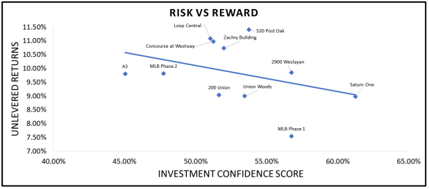 and this is due to a specific product type or some unique attribute within the investment. For example, A3 (Airport 3 portfolio in Charlotte) contains a large amount of flex industrial or single-story office that provides overall lower return despite the implied risk. Market at Lake Boone (MLB Phase 1) contains a large amount of mixed-use retail which also “prices” at lower overall returns. Saturn One, on the other hand, provides a classic example of the direct correlation to lower risk and a high confidence score; thus, it sits on the very end of the trendline (blue line). Saturn One is a strong core-plus office investment featuring a strong WALT, excellent tenant credit, and it was conservatively financed; hence, the highest confidence score on the table, with conservative unlevered return.
Rampant Inflation……or the Last Great Heresy?
As we go to press this quarter, the dominant story in financial markets and among economists is the rapid rise in long term interest rates. Not only have long-term Treasury rates in the U.S. jumped significantly in the past two weeks, but long-term sovereign rates across the globe are up, in many cases back into positive territory for the first time in a while. Consequently, the amount of sovereign debt trading at negative rates has shrunk by several trillion dollars from a peak of about $18 trillion just a few weeks ago. The prevailing narrative attached to why this is happening includes conviction that the massive fiscal stimulus, coupled with ultra-expansionary monetary policy, is (or will be) driving a sharp rebound that will overwhelm the output gap and cause meaningful inflation for the first time in over a decade. Early signs of inflation have indeed shown up at the wholesale level, as the January Producer Price Index jumped 1.3% for the month.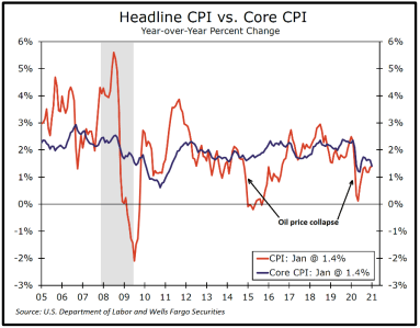 The year-over-year print was much more subdued however at 1.7%, reflecting the fact that input prices have been suppressed during the pandemic. Pricing pressures have yet to materialize at the consumer level however as the January core CPI (excl. food & energy) was unchanged for the month and both headline and core are up only 1.4% year-over-year. See nearby chart. Of course, your perspective on inflation varies depending on your consumption patterns. If you have kids in college (forgive us: meant to say kids taking college classes online!), or if you have a long commute to work (gas prices up 7.4% in January), you may have a different opinion about inflation.
Nonetheless, since virtually all the smart people in Washington DC are dyed in the wool Keynesians, everyone has convinced themselves that deficit spending produces economic growth. As you may have guessed from the clever title at the head of this section, we are here to at least suggest a heretical alternative thesis. While we don’t deny that the leading indicators, especially commodity prices, are pointing to a sharp recovery, we think it perhaps possible that 1) the sharp recovery is more a natural transitory reaction to the sharp contraction, 2) government spending has a negative multiplier, and 3) that after a short period of above trend growth, the US economy will return fairly quickly to its longer term trend growth, which is slow, and possibly even slower in the future given the long term effects of the debt incurred to fund the fiscal blowout.
The Zarnowitz Rule, named after Victor Zarnowitz, a professor of economics at the University of Chicago and distinguished business-cycle expert at the National Bureau of Economic Research (NBER), the outfit that gets to officially date business cycles in the U.S., hypothesizes that the deeper a business cycle contraction is, the greater magnitude the rebound will be. We certainly saw that with a Q3-2020 GDP print of 33.4% (3rd revision), followed by a more mellow 4.1% Q4 (2nd revision). Of course, Q4 was impeded by a resurgence of COVID. Forecasters are all over the board for Q1-21 and Q2-21, but there is a strong consensus that both quarters will likely see faster growth than Q4 did. This alternating amplitude is a classic recovery pattern, identified by Zarwonitz. The nearby chart shows the experience coming out of the global financial crises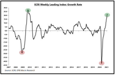 (GFC) as well as the beginning of the current recovery using the Weekly Leading Index: Growth Rate compiled by ERCI. Growth rates after the initial burst following the GFC returned to a more normal, muted pattern fairly soon after the surge at the beginning of the recovery.
Yes, but…..the amount of “stimulus” this time has been huge! Much more than the GFC. True, but much of the federal government spending has been transfer payments, some estimates indicate up to 70%. Taking money from savers and giving it to others with the expectation it will be spent and boost growth. We are very sympathetic to the assistance payments made to those in true need because of lost employment, a traditional and necessary role for governments to play. But most stimulus payments directly to individuals have been payments to people who still have a job, and they are saving it, thus simply moving money from one saver to another. Indeed, the savings rate for households is way up. Eastdil Secured reported: “Individuals making less than $46,000/yr spent 7.9% of the stimulus funds within two weeks, versus just 0.2% by those making above $78,000/yr. Roughly 55% of people between the ages of 25 and 54 reported their primary use of the second stimulus payment was to pay off debt. Roughly 25% of respondents reported that they saved it. The countervailing argument can be found in JPM checking account data: After jumping $900 in April, median checking account balances lost 50 percent of the initial balance gains through December, highlighting in part that the money ultimately does (largely) get spent.”
Even if a large portion of the funds eventually get spent, we are mostly just pulling forward future consumption, ensuring slower future growth. If recipients pay down debt, we are simply transferring debt from households to the federal government. Not a stimulating transaction at all! In fact, as previously discussed in these pages, there are several unchallenged studies showing the productivity of debt, growth in GDP per dollar of debt incurred, has diminishing returns in all developed countries as the total debt burden rises. Some economists do dispute the notion that government spending as we practice it has a negative multiplier, meaning a dollar spent results in less than a dollar’s worth of GDP, but there are some studies that make the case convincingly. We lean towards break-even at best, or more likely slightly negative.
So, after a short burst of higher than trend growth, why must we return to lower growth? Our long-term trend growth capacity is driven primarily by two factors, population growth and productivity. Both are in secular declines. Government borrowing to fund transfer payments also reduces resources available for the kind of spending that clearly does have a positive multiplier like education, infrastructure, and capital investments, which are crucial to boosting productivity. This trend of diverted resources can be seen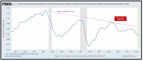 in the nearby chart which shows that U.S. fixed investment in non-residential structures as a percentage of GDP is clearly trending down from cycle to cycle. Peak investment as a percent of GDP going back to the recovery of the 1990s has fallen from roughly 10.7% of GDP to 9.6% in 2015, the peak during the most recent cycle. The post-recessionary troughs are also lower from cycle to cycle.
Population growth is also in long-term decline for all major global economic zones. This is a fact that all of our readers are no doubt familiar with, but it sometimes helps to see it illustrated, so we have included a graph nearby showing the U.S. population growth dating back to 1900. Not encouraging in terms of supporting a higher long-term economic growth trend. The combined effects of declining investment spending, which constrains productivity growth, and declining population growth place significant limitations on the potential growth rate of GDP over the intermediate and longer term.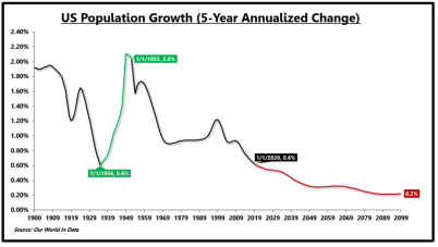
Back to the DC Keynesians for a moment. Keynes’ most influential book, The General Theory of Employment, Interest and Money, was published in 1936. One of the most significant publications of economic thought ever penned, along with Adam Smith’s The Wealth of Nations (1776) and Milton Friedman’s A Monetary History of the United States (1963), which very likely anchored the philosophical basis for the Fed policies implemented by Greenspan and Bernanke in response to the 2000 stock market crash and the Global Financial Crisis. Unfortunately, both politicians who craft fiscal policy, and central bankers who force monetary policy upon us, predominantly point to only one side of the theories promulgated by Keynes and Friedman. In defense of Keynes (a position we don’t often take), he argued that while governments should run budget deficits in recessionary times to “stimulate” aggregate demand, he also suggested surpluses should be accumulated during expansions to preserve sovereign solvency among other benefits. Since Keynes published his book in 1936, there have been only 11 years when the U.S. ran a budget surplus. That is 73 years of deficits, compared to 11 surpluses. The last year of surplus was 2001, and our readers know where the national debt stands.
Not to be outdone by the politicians, central bankers are stuck in the asymmetry of ultra-loose monetary conditions in the futile attempt to drive greater economic output. The result of this vain and enduring initiative is asset price inflation, which exacerbates income inequality, and the perpetuation of inefficient (zombie) enterprises (and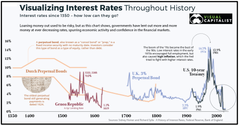 governments), but not much net contribution to aggregate output, or inflation. How low have rates been in historical context, and could things be “different this time?” We recently came across a chart from the Visual Capitalist. Great web site, and we would encourage readers to check it out here or by clicking on the chart, which tracks interest rates back to the 1300’s!! Most folks’ historical context for interest rates generally includes only the rates experienced during their lifetime, and even many economists only think about interest rates in the context of post WWII economic history. Kind of fun to look further back, and in this case, much further back. Note there is a Dutch Perpetual Bond from 1624 that is still paying interest. Cool!
We do take one exception with the presentation by Visual Capitalist. The narrative for the U.S. 10-year Treasury rate in the chart claims interest rates and unemployment were low in the early 1970s which is not quite accurate. Looking at the graph above, UST10 interest rates (green line) fluctuated around 6% in the early 70s, higher than the average for the prior expansion of the 1960s, and unemployment (blue line) was higher than the prior expansion.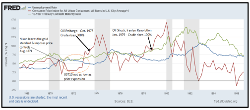 Inflation (red line) was rising after the lifting of Nixon’s price controls, started to fall briefly, then it spiked with the October 1973 Oil Embargo. We have postulated on these pages before that since the widespread adoption of the internal combustion engine in the early 20th century, bouts of inflation and disinflation are in large part driven by rapid changes in the price of oil. Our view is the “great inflation” of the 1970s was caused not by low interest rates but by a combination of decoupling from the gold standard (Aug. 1971) and the two oil shocks in 1973 and 1979 wherein the global price of crude oil rose 300% and 100%, respectively. We have attempted to illustrate this argument in the chart on the previous page.
Last quick missive on inflation. Other things can cause temporary inflation, like logistical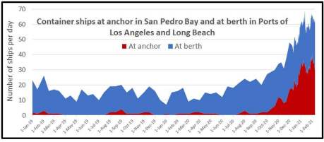 bottlenecks resulting from COVID. There is currently a huge logjam in the Pacific Ocean offshore from the two Los Angeles ports. Look at this final chart. The problem is in large part due to COVID restrictions on the docks slowing the offloading of containers. Also, part of quite notable rise in copper prices stems from labor and other production constraints at the world’s large copper mines resulting from COVID. So, while COVID can impair economic activity, it can also produce inflation. Seems like the perfect weapon to wreak havoc with market based economies………..
- Real Estate Market Conditions: Pages 1 - 4. In this section, the TEAM (Kevin Ellis lead the charge) discusses our opinions on how office using employment (both employers and their employees) continues to adapt, and we highlight a few takeaways from the latest forward thinkers on the future use of office space. Conclusion: Cautious optimism for the long term.
- Real Estate Market Conditions 0: Pages 4 - 9. The TEAM (kudos to Wilson Prioleau for providing the material for this topic) summarizes a quantitative internal risk analysis we developed, entitled a “Confidence Score” for existing and new investments. Through this analysis we can quantify and catalogue this “Confidence Score” for each of our historical, current and potential future investments and compare this score to our achieved and underwritten returns.
- Macro-Economic Conditions: Page 10. In this section, we will assess the recent rise in long term interest rates and whether inflation fears are warranted. Conclusion: Near term caution may indeed be in order, but sustained inflationary pressures are unlikely.
Real Estate Market Conditions
To wind up our Q4-2020, you, our investors, have continued to ask for insights on the impact COVID-19 has had on our portfolio as well as office-use in general. Our existing portfolio has witnessed a steady return of office users and the resulting increase in office utilization since the peak of lockdowns; no new news since last quarter. In the Q3-2020 report we highlighted the future of office-use over the long-term, and if it will ever return to pre-COVID levels (yes, we believe so). Over the last 90+ days we have continued to stay attuned to various real estate brokerage houses, investment banking firms, architects, consultants, and survey materials regarding the impacts of COVID-19 on the real estate sector. One third party, Cushman Wakefield, has done an excellent job of analyzing and formulating sound opinions and forecasts through various surveys, research and data sets regarding the return of office.
To recap, a few brief takeaways in our opinion since the pandemic began and the effects on the office worker and the built environment:
- Employees can be more productive from home than originally thought,
- Employees want to be in the office for personal development (FOMO, will explain below),
- Employees want flexibility from their employer to provide Work-From-Home (“WFH”) options,
- Employers need employees to be in the office to foster innovation, culture, and productivity,
- Employers can have some cost saving if employees WFH, and
- High-density open-office designs are counterproductive to fostering communication and innovation.
These takeaways have various dynamics which when combined will impact future office-use. In particular, the occupation of an employee or the industry sector of an office-using business are significant in determining office utilization. Our view is that businesses will continue to need office space as mentioned last quarter, and they will use roughly similar amounts compared to pre-COVID levels, though the way they utilize this space will be altered. What has not yet evolved with clarity are the specific changes that will be needed and how quickly these changes will come about. We will continue to focus on serving the needs of our customers (tenants) as they adapt and will do our best to match our office space offerings within the portfolio to their required adaptions.
A key question for us as owners of real estate - why do businesses need office space and what as owners should we focus on to maintain tenancy? The answer to this question is changing. Historically the top reasons businesses required office space were: A) for management teams overseeing their employees and encouraging productivity, B) access to workplace amenities (fitness centers, tenant lounge, etc..) to provide one-stop-shop convenience for employees thereby increasing productivity, C) office designs which helped foster company culture, and D) high-end office space to help attract the best talent. These reasons will remain key drivers, but each will be altered in some capacity moving forward balancing culture, productivity and location. We will break down two key components of office space, productivity and culture, because in our view these two items are essential for office using businesses. With the impacts of COVID we continue to watch intently how these two core attributes drive office occupier requirements and how we can assist our customers in achieving an optimal balance.
Productivity: Various reports have commented on the surprising outcome of how remote work has performed during COVID-19. Cushman & Wakefield’s report, New Perspective: From Pandemic to Performance, highlights a study recently completed by McKinsey which found that 41% of employees believe they are “more productive” at home and 28% believe they are “as productive.” While many employees feel they are as or more productive at home, there is a question as to how sustainable productivity will be in the remote work environment. Several noticeable issues have arisen via the WFH experiment, those include virtual meeting over-load contributing to a lack of productivity, decreased collaboration and innovation amongst teams, and an old term “Fear of Missing Out” or FOMO has now weaved its way into the real estate lexicon. All these issues are solvable by returning to the built environment (at near pre-COVID levels). As stated in past reports we believe office demand will revert to the mean with employers offering their employees a hybrid schedule of WFH and being in the office so FOMO doesn’t occur! To further support this likely outcome in the U.S. per Cushman & Wakefield: New Perspective: From Pandemic to Performance “….an owner with locations in China and Korea noted that, as of October 2020, businesses were back to in the office at pre-pandemic levels, adding they expected similar results across other markets once the virus’ spread is under control.” To boot, several large corporate users of office space agree their productivity has decreased and businesses are feeling the impacts of WFH. For example, several prominent company CEO’s including JP Morgan Chase, Netflix, Cisco, Goldman Sachs, and Walmart have clearly stated in various articles and press releases the need for their employees to come back to the office.
To help us further determine in real time what is happening with the WFH experiment in our own portfolio, we can now analyze and assure our customers of the best service by checking usability across each asset, City, and/or State in which we own.
The graphic herein is our first “beta” test of our portfolio to understand our utilization rates across four states. The data shows an increase of utilization rate to just over 40% as of January 2021, a substantial increase from 25%+ in Q2-20. We are continuing to refine this data from each property into our BI (business intelligence) system, which we call Griffin Essential. This table is not 100% precise as it only samples a portion of our portfolio. As we say to our broker friends “take everything with a grain of salt”, but the point illustrated remains valid, utilization is slowing trending back to the mean as anticipated.Culture: Peter Drucker said, “culture eats strategy for breakfast.” For many businesses, the impact on culture is one of the largest concerns for employees working remotely. In a survey done by Cushman & Wakefield, 50% of employees struggled to feel connected to their company and coworkers while working remotely during COVID. This lack of connection could potentially lead to difficulty retaining employees. The disruption of culture from working remotely is also susceptible to a snowball effect, especially given working remotely makes it easier for employees to move companies. The cycle would go something like the following – remote work leads to a lack of culture, lack of culture leads to employees leaving (which is easier when working remotely), employees leaving leads to lack of culture, and on and on.
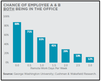
The human interaction side of a business is also key for employee development. Per a George Washington University analysis (see graphic nearby), even light WFH policies of 1 day a week significantly change the number of times teams will interact in person. For example, if a team of 20 employees each WFH two days per week then there is less than a 10% chance of more than 50% of the team being in the office together on any given day. This is a problem if your business is built on collaboration, innovation, and communication amongst the team. Further, as illustrated in the bar chart below, if two employees work remotely only 1.5 days a week, the chance of both being in the office at the same time are 41%, versus 88% if there are no WFH days per week.
So, what does all this mean for a business trying to maintain a “Culture?” The conclusions from a series of recent reports we have continued to reference herein (Cushman & Wakefield: New Perspective: From Pandemic to Performance) include the following:
- Employees need direct interaction with management for career development.
- Employees need direct collaboration to innovate.
- Employees need social interaction to maintain shared vision and purpose.
These bulleted items above point to the conclusion that office owners and their tenants will do their best to maintain productivity and culture within their office environments, and we as office owners will see the following occur:
- Hybrid: The future of office use will be a hybrid of WFH and being in the office to maintain human interaction.
- Flex: Owners of real estate will become providers of “flex” space for their customers such as community space or various break out rooms within an occupant’s space for collaboration which include areas to congregate (sitting areas, green spaces, conference rooms).
Real Estate Market Conditions 2.0
What is Risk and How does an Investor Quantify it?
When real estate sponsors talk about investment offerings, most often they mention the phrase “strong risk adjusted returns.” Well, what does that really mean? According to Investopedia.com, “A risk-adjusted return is a calculation of the profit or potential profit from an investment that considers the degree of risk that must be accepted to achieve it. The risk is measured in comparison to that of a virtually risk-free investment – typically versus U.S. Treasuries….” So, when we or sponsors like us, mention overall risk adjusted returns, we are generally referring to an Equity Risk Premium. This calculation usually references equity investing in the stock market, but this can be applied to any type of equity investment. The next several pages we will summarize how we quantify risk for each of our investments with an internally developed “Confidence Score” which assists the TEAM in determining each asset’s allowable “equity risk premium” or, as we typically state, is the best “risk adjusted return” for a particular investment.
As part of each investment review process, either newly acquired, developed, or existing assets, we make every effort to quantify risk. As part of our investment and due diligence process, we take several factors into account. Over the last year while prepping for the launch of our latest investment fund and while COVID-19 was allowing us some “free time” during a choppy capital market period, we further refined our system to thoroughly quantify and catalogue the risk score of each of our current investments and potential future investments. We can then compare this “Confidence Score” to our underwritten returns. Further, upon realization of our investments, we can compare actual returns to the perceived risks at acquisition and use this data to continually hone our understanding of different risk factors. These evaluations are one of the tools in our toolbox used to determine the type of investment opportunity presented by each asset’s investment profile, such as a core, core plus, value add, opportunistic. Once the investment opportunity profile is determined it allows us to set general expectations on pricing and overall risk and return synopsis. The first step in the process to create the “Confidence Score” is to determine what risks private real estate investments face. We broke these risks into three categories; External Risks, Internal Risks, and Financing Risks summarized over the next few pages.
One final item to note within our risk assessment system, Griffin quantifies investment risk in an inverse fashion. For example, instead of saying something is “high risk,” our criteria would state the investment has a “low Confidence Score,” and, conversely, for a “low risk” investment, Griffin would say that the investment demonstrates a “high Confidence Score.”
The following provides more details on each “Risk” and several key factors and methodologies we apply to formulate our Confidence Score. This is not intended to cover ALL the items we review.
External Risks:
The first step is to assess external market risk. External risk is market and possible systemic risks facing the overall location. These risks include items such as historical market and submarket real estate fundamental performance, market cycle timing, forward rent growth projections, historical occupancy and rental rate performance, as well as overall walk and transit scores related to the investment location.
Assessing market risk requires determining where each market is within the real estate cycle and, more specifically, how the submarket containing the potential investment is currently performing with respect to its historical performance. This enables the Acquisition Team to make well informed projections on the future performance of the market and submarket. As mentioned above, the first step is determining where the macro market falls within the real estate cycle; we do this semi-annually by assessing Real Estate macroeconomic data compiled by the research departments of major brokerage houses and data aggregators. We collect and analyze this data to create a “House View” on where each market finds itself in the real estate cycle, which is conveniently referred to as the “property clock.” The property clock below is an example of where a market sits within the real estate cycle.
Upon completing the market review, we evaluate historical trends in rent and occupancy at both the asset and the submarket level.
The historical evaluation of rent and occupancy is a key component to External Risks, and you’ve likely heard one of us mention the following in regard to a potential investment “…is there intrinsic demand for this asset?” The upshot to this important historical analysis is how the asset has performed versus its peers, has the asset shown a declining occupancy trendline and does the asset provide a strong peak to peak rent growth trend line. If both occupancy and rent have trended flat or negative, there is no valid reason in our opinion to proceed with the investment, unless something functionally or demographically we have uncovered could change tenant demand (occupancy) and rents.The two example graphs below assist in this determination of intrinsic demand displaying peak-to-peak rental rate and occupancy trends of an asset. The data points in these two graphs tell us that there is intrinsic demand for the asset as both peak-to-peak rent growth and strong historical occupancy compared to its peers are upward or positive in trajectory. The graphic below is Loop Central in Houston, and the takeaways are the asset averaged 89% occupancy over 12+ years although it underperformed its peers in rents (a sign we can add value). Further, the peak-to-peak rent growth is evident in its upward trajectory (average dotted line on top graph). These two metrics are evidence to us of intrinsic demand and also that the property is a value alternative for its occupants and therefore an opportunity for us to create additional value.
One other aspect Griffin finds worthy of strong consideration, especially as it relates to external investment risk, is the Walk and Transit Scores (click here). These scores determine how accessible the building is and its proximity to appealing amenities such as restaurants, parks, transit stops, apartments, and others. A higher score means the asset is “ideally located,” and, thus, the investment possesses diminished locational risk. The combined assessment of these risk attributes allows Griffin to quantify the amount of location risk each investment possesses and, thus, the amount of location risk that Griffin is onboarding into its portfolio.
Internal Risks:
The second prong of our risk assessment quantifies risks specific to the functionality, operations, and future cash flow of the particular property. Internal Risks are items such as the physical building, current capital and repair and maintenance performance, as well as the existing rent roll. For example, these primary base building items include the building’s age, ceiling heights, window systems, parking ratios, and other investment specific risks related to the rent roll such as weighted average lease term (WALT), tenant size, tenant concentration, and tenancy credit. Another key component of the internal risk factors is dissecting the rent roll.
We spend a fair amount of time on all aspects of the tenancy, such as the WALT, tenant industries, tenant size, credit worthiness, in-place rents relative to market, specific lease terms such as termination options, contraction options, etc… All these items related to the rent roll drive our internal risk factors and help determine the “Confidence Score.” The following screen shot is a real time example of our methodology and process completing this Internal Risk score within our web-based platform, Griffin Essential.
Financing Risks:
Financing risks are inherent when applying leverage to any investment; this includes initial loan to cost as well as cumulative loan to cost … (not loan to value!), interest rate exposure, guaranty and recourse obligations, to name a few. Over leveraging an investment remains one of the major killers of real estate investment. Griffin Partners has an aversion to “high” leverage, and each of our Funds include covenants that restrict borrowing to not exceed 65% cumulative loan to cost (not loan to value as value is arbitrary) over the life of the investment. The simple theory behind this covenant is to prevent the exact question our friend Fry is asking in the picture on the next page. Leverage, while extremely powerful and useful to raise equity returns, can also very quickly turn against an owner in various forms. First lien lenders represent the highest position on the seniority chart in terms of cash distributions; thus, if an investment sours and cash flow dries up at the property, the lender may force a cash flow sweep. Assuming the investment retains value, and the equity owner/operator successfully executes a transaction to restabilize the investment while in this sweep position, the owner may un-wind themselves from this cash flow sweep position. Otherwise, the lender may take various measures that could further erode the equity value. So, in short, we shy away from too much leverage.
As stated above, Griffin remains relatively risk averse when it comes to leverage, and we quantify the Financing Risks by looking at the underwriting’s cumulative Loan-to-Cost ratio, whether we have interest rate hedging in place, the amount of recourse required by the loan, the underwritten debt yield, debt service coverage ratio, and the amount of cash reserves required by an existing or anticipated loan. As almost every investment Griffin makes has some sort of debt obligation attached to the property, the risk that could come from an unanticipated interest rate shock, overleveraging, or excessive recourse requirements is weighted very heavily within our “Confidence Score” calculation.
The preceding methodology outlines in summary form our “House View” on how to quantify risk and the potential impacts these three risk factors (External, Internal and Financing Risks) have on our underwritten returns and investment valuations. Further, the chart below pinpoints our “Confidence Scores” for all our current Fund III office investments, and we have plotted them against our unlevered underwritten returns.As you can see, the general trend of risk vs reward correlation holds true; as investment confidence increases, the underwritten unlevered return decreases accordingly. As the portfolio “Investment Confidence Score” decreases (moves left), the underwritten returns increase to account for the additional risk taken. Hence the inverse correlation between risk rating and unlevered return. There are a few outliers plotted as the general trend line infers (in blue),
and this is due to a specific product type or some unique attribute within the investment. For example, A3 (Airport 3 portfolio in Charlotte) contains a large amount of flex industrial or single-story office that provides overall lower return despite the implied risk. Market at Lake Boone (MLB Phase 1) contains a large amount of mixed-use retail which also “prices” at lower overall returns. Saturn One, on the other hand, provides a classic example of the direct correlation to lower risk and a high confidence score; thus, it sits on the very end of the trendline (blue line). Saturn One is a strong core-plus office investment featuring a strong WALT, excellent tenant credit, and it was conservatively financed; hence, the highest confidence score on the table, with conservative unlevered return.Macro-Economic Conditions
Rampant Inflation……or the Last Great Heresy?
As we go to press this quarter, the dominant story in financial markets and among economists is the rapid rise in long term interest rates. Not only have long-term Treasury rates in the U.S. jumped significantly in the past two weeks, but long-term sovereign rates across the globe are up, in many cases back into positive territory for the first time in a while. Consequently, the amount of sovereign debt trading at negative rates has shrunk by several trillion dollars from a peak of about $18 trillion just a few weeks ago. The prevailing narrative attached to why this is happening includes conviction that the massive fiscal stimulus, coupled with ultra-expansionary monetary policy, is (or will be) driving a sharp rebound that will overwhelm the output gap and cause meaningful inflation for the first time in over a decade. Early signs of inflation have indeed shown up at the wholesale level, as the January Producer Price Index jumped 1.3% for the month.
The year-over-year print was much more subdued however at 1.7%, reflecting the fact that input prices have been suppressed during the pandemic. Pricing pressures have yet to materialize at the consumer level however as the January core CPI (excl. food & energy) was unchanged for the month and both headline and core are up only 1.4% year-over-year. See nearby chart. Of course, your perspective on inflation varies depending on your consumption patterns. If you have kids in college (forgive us: meant to say kids taking college classes online!), or if you have a long commute to work (gas prices up 7.4% in January), you may have a different opinion about inflation.Nonetheless, since virtually all the smart people in Washington DC are dyed in the wool Keynesians, everyone has convinced themselves that deficit spending produces economic growth. As you may have guessed from the clever title at the head of this section, we are here to at least suggest a heretical alternative thesis. While we don’t deny that the leading indicators, especially commodity prices, are pointing to a sharp recovery, we think it perhaps possible that 1) the sharp recovery is more a natural transitory reaction to the sharp contraction, 2) government spending has a negative multiplier, and 3) that after a short period of above trend growth, the US economy will return fairly quickly to its longer term trend growth, which is slow, and possibly even slower in the future given the long term effects of the debt incurred to fund the fiscal blowout.
The Zarnowitz Rule, named after Victor Zarnowitz, a professor of economics at the University of Chicago and distinguished business-cycle expert at the National Bureau of Economic Research (NBER), the outfit that gets to officially date business cycles in the U.S., hypothesizes that the deeper a business cycle contraction is, the greater magnitude the rebound will be. We certainly saw that with a Q3-2020 GDP print of 33.4% (3rd revision), followed by a more mellow 4.1% Q4 (2nd revision). Of course, Q4 was impeded by a resurgence of COVID. Forecasters are all over the board for Q1-21 and Q2-21, but there is a strong consensus that both quarters will likely see faster growth than Q4 did. This alternating amplitude is a classic recovery pattern, identified by Zarwonitz. The nearby chart shows the experience coming out of the global financial crises
(GFC) as well as the beginning of the current recovery using the Weekly Leading Index: Growth Rate compiled by ERCI. Growth rates after the initial burst following the GFC returned to a more normal, muted pattern fairly soon after the surge at the beginning of the recovery.Yes, but…..the amount of “stimulus” this time has been huge! Much more than the GFC. True, but much of the federal government spending has been transfer payments, some estimates indicate up to 70%. Taking money from savers and giving it to others with the expectation it will be spent and boost growth. We are very sympathetic to the assistance payments made to those in true need because of lost employment, a traditional and necessary role for governments to play. But most stimulus payments directly to individuals have been payments to people who still have a job, and they are saving it, thus simply moving money from one saver to another. Indeed, the savings rate for households is way up. Eastdil Secured reported: “Individuals making less than $46,000/yr spent 7.9% of the stimulus funds within two weeks, versus just 0.2% by those making above $78,000/yr. Roughly 55% of people between the ages of 25 and 54 reported their primary use of the second stimulus payment was to pay off debt. Roughly 25% of respondents reported that they saved it. The countervailing argument can be found in JPM checking account data: After jumping $900 in April, median checking account balances lost 50 percent of the initial balance gains through December, highlighting in part that the money ultimately does (largely) get spent.”
Even if a large portion of the funds eventually get spent, we are mostly just pulling forward future consumption, ensuring slower future growth. If recipients pay down debt, we are simply transferring debt from households to the federal government. Not a stimulating transaction at all! In fact, as previously discussed in these pages, there are several unchallenged studies showing the productivity of debt, growth in GDP per dollar of debt incurred, has diminishing returns in all developed countries as the total debt burden rises. Some economists do dispute the notion that government spending as we practice it has a negative multiplier, meaning a dollar spent results in less than a dollar’s worth of GDP, but there are some studies that make the case convincingly. We lean towards break-even at best, or more likely slightly negative.
So, after a short burst of higher than trend growth, why must we return to lower growth? Our long-term trend growth capacity is driven primarily by two factors, population growth and productivity. Both are in secular declines. Government borrowing to fund transfer payments also reduces resources available for the kind of spending that clearly does have a positive multiplier like education, infrastructure, and capital investments, which are crucial to boosting productivity. This trend of diverted resources can be seen
in the nearby chart which shows that U.S. fixed investment in non-residential structures as a percentage of GDP is clearly trending down from cycle to cycle. Peak investment as a percent of GDP going back to the recovery of the 1990s has fallen from roughly 10.7% of GDP to 9.6% in 2015, the peak during the most recent cycle. The post-recessionary troughs are also lower from cycle to cycle.Population growth is also in long-term decline for all major global economic zones. This is a fact that all of our readers are no doubt familiar with, but it sometimes helps to see it illustrated, so we have included a graph nearby showing the U.S. population growth dating back to 1900. Not encouraging in terms of supporting a higher long-term economic growth trend. The combined effects of declining investment spending, which constrains productivity growth, and declining population growth place significant limitations on the potential growth rate of GDP over the intermediate and longer term.
Back to the DC Keynesians for a moment. Keynes’ most influential book, The General Theory of Employment, Interest and Money, was published in 1936. One of the most significant publications of economic thought ever penned, along with Adam Smith’s The Wealth of Nations (1776) and Milton Friedman’s A Monetary History of the United States (1963), which very likely anchored the philosophical basis for the Fed policies implemented by Greenspan and Bernanke in response to the 2000 stock market crash and the Global Financial Crisis. Unfortunately, both politicians who craft fiscal policy, and central bankers who force monetary policy upon us, predominantly point to only one side of the theories promulgated by Keynes and Friedman. In defense of Keynes (a position we don’t often take), he argued that while governments should run budget deficits in recessionary times to “stimulate” aggregate demand, he also suggested surpluses should be accumulated during expansions to preserve sovereign solvency among other benefits. Since Keynes published his book in 1936, there have been only 11 years when the U.S. ran a budget surplus. That is 73 years of deficits, compared to 11 surpluses. The last year of surplus was 2001, and our readers know where the national debt stands.
Not to be outdone by the politicians, central bankers are stuck in the asymmetry of ultra-loose monetary conditions in the futile attempt to drive greater economic output. The result of this vain and enduring initiative is asset price inflation, which exacerbates income inequality, and the perpetuation of inefficient (zombie) enterprises (and
governments), but not much net contribution to aggregate output, or inflation. How low have rates been in historical context, and could things be “different this time?” We recently came across a chart from the Visual Capitalist. Great web site, and we would encourage readers to check it out here or by clicking on the chart, which tracks interest rates back to the 1300’s!! Most folks’ historical context for interest rates generally includes only the rates experienced during their lifetime, and even many economists only think about interest rates in the context of post WWII economic history. Kind of fun to look further back, and in this case, much further back. Note there is a Dutch Perpetual Bond from 1624 that is still paying interest. Cool!We do take one exception with the presentation by Visual Capitalist. The narrative for the U.S. 10-year Treasury rate in the chart claims interest rates and unemployment were low in the early 1970s which is not quite accurate. Looking at the graph above, UST10 interest rates (green line) fluctuated around 6% in the early 70s, higher than the average for the prior expansion of the 1960s, and unemployment (blue line) was higher than the prior expansion.
Inflation (red line) was rising after the lifting of Nixon’s price controls, started to fall briefly, then it spiked with the October 1973 Oil Embargo. We have postulated on these pages before that since the widespread adoption of the internal combustion engine in the early 20th century, bouts of inflation and disinflation are in large part driven by rapid changes in the price of oil. Our view is the “great inflation” of the 1970s was caused not by low interest rates but by a combination of decoupling from the gold standard (Aug. 1971) and the two oil shocks in 1973 and 1979 wherein the global price of crude oil rose 300% and 100%, respectively. We have attempted to illustrate this argument in the chart on the previous page.Last quick missive on inflation. Other things can cause temporary inflation, like logistical
bottlenecks resulting from COVID. There is currently a huge logjam in the Pacific Ocean offshore from the two Los Angeles ports. Look at this final chart. The problem is in large part due to COVID restrictions on the docks slowing the offloading of containers. Also, part of quite notable rise in copper prices stems from labor and other production constraints at the world’s large copper mines resulting from COVID. So, while COVID can impair economic activity, it can also produce inflation. Seems like the perfect weapon to wreak havoc with market based economies………..