It has been quite an interesting summer, which is winding down as we write despite the prospect of another month of heat here at HQ. It seems like the summer has been defined by contrasts with countervailing forces lining up against each other of late. While politics in DC are more roiled than ever, the US economy has accelerated propelling business and consumer sentiment to very high levels. While the US economy is accelerating, most of the rest of the world is slowing down. And while record amounts of real estate investment capital have been raised, much of it is sitting on the sidelines – dry powder. Lastly, it has been quite wet in parts of the east, but the US west has been exceptionally dry with an inordinate amount of wildfires causing destruction and threatening lives and property. Having lived through Harvey at this time last year, we feel great sympathy for our fellow citizens having to deal with these weather caused calamities this summer. As you may have come to expect, we have some observations below on the conflicting economic signals.
Our acquisition pipeline is swelling with activity, although the team feels like it is getting harder to get things over the finish line. One acquisition was completed over the summer, but one pending sale failed to close as the buyer defaulted and forfeited his deposit.
The team did complete our semi-annual target market conditions update, a summary of which is shared with you below.
Fund Updates
In June, Fund III completed the acquisition a 234,000 industrial property in Houston in a joint venture partnership with the same institutional investor with whom Fund III acquired Loop Central in March. This is the first of what we expect to be several industrial acquisitions in Houston as the JV partners intend to acquire a series of individual infill industrial assets and then exit the assemble portfolio in a single portfolio sale a few years down the road. We expect the portfolio to eventually have 10 to 15 assets worth about $150 million. These will generally be second generation properties with clear heights in the mid 20’ range with superior locations, a.k.a. “last mile” fulfillment facilities. While we are not underwriting a portfolio premium upon dale, we do hope to capture one. With this industrial acquisition, Fund III now owns five assets in three states, and as we go to press there are two more acquisition opportunities that have a very high probability of being acquired prior to year-end.
Fund II still owns four of the eleven assets it acquired. One of Fund II’s assets in Phoenix had been under contract to be sold with a non-refundable deposit securing the buyer’s obligations. Regrettably, the buyer was unable to assemble the capital required to close the purchase and defaulted on the contract, forfeiting his six figure deposit. Our plan is to take the property off the market, respond to a request by a large tenant for an extended lease term, and then bring the property back to market next year.
Real Estate Market Conditions
A year ago we gave readers a glimpse inside the internal analysis we conduct semi-annually on the market fundamentals within our ten target markets. The data we gather comes from various sources including the research teams of large national brokerages, commercial data gathering services to which we subscribe and pay fees for access, government statistics and importantly from our own proprietary database to which we are constantly adding information about properties. On a semi-annual basis our team reviews the market data in detail and produces an assessment of the current conditions in each of our target markets. We then use the assessment to guide our strategy and activities for both acquisitions and dispositions.
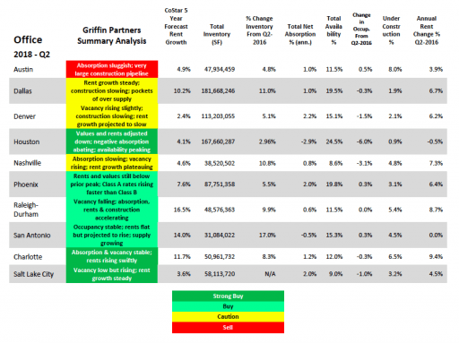
Readers may recall we often point out that various markets are frequently at different stages in the commercial real estate (CRE) cycle as compared to other markets at any given time. The global real estate services firm Jones Lang LaSalle (JLL) illustrates these differences in a graphic called the “property clock,” which illustrates where the conditions in different markets are relative to the standard real estate cycle. Many firms use this standard four phase cycle analysis, with some minor variations between firms. In the case of JLL, the four phases of the cycle are rising, peaking, falling and bottoming. We have borrowed the property clock illustration concept from our friends at JLL and use our semi- annual target markets assessment to construct our own property clock. A summary of this data for office and our most recent office property clock is shown below. We do a similar analysis for industrial, but the relative outperformance of industrial properties amongst real estate classes across all geographies has made for a boring chart, with all of our five industrial target markets clumped together in the peaking phase. Dallas may be the only exception, just edging over the line into the falling phase.
Here is our current assessment of the ten office markets we target, followed by the property clock on the next page:
In recent reports we have chronicled the gradual decline in transaction volume, which is driven by a number of factors including 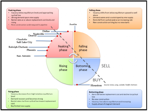 pricing dislocation arising from the gap in buyer and seller expectations, rising interest rates, and fears about the length of the cycle, all of which have caused a growing number of investors to postpone trades, despite having large amounts of dry powder on hand. Foreign capital which had been targeting primarily core CBD office assets in a few top cities, has been a little less inhibited than domestic capital recently and is now moving out into secondary markets much more frequently. MetLife Investment Management Head of Real Estate Research Adam Ruggiero said foreign capital is “likely to become a more permanent presence, increasing liquidity in the
 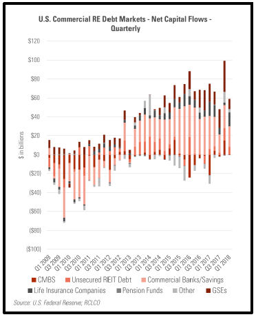 secondary markets and marginally reducing competition in the largest markets.” One notable exception is China, which only a few years ago saw major capital flowing out of China into US real estate and other assets, but has now seen a reversal (some would say a clamp down!) and actually posted net outflows from US CRE in the last quarter.
A meaningful amount of capital targeted for CRE is flowing into debt funds, moving up the capital stack away from equity towards debt to reduce risk, albeit at a lower return. Perhaps a much lower return based on our observations that the spread between bank loans and debt fund loans is compressing as a result of a hyper competitive lending environment. The availability of CRE debt capital remains near cycle highs as can be seen in the nearby chart of net capital flows in the US CRE debt markets.
Rising interest rates on the short end of the curve have so far had little impact on CRE cap rates, which have been relatively flat since the second quarter of 2014. According to CBRE’s cap rate survey for the first half of 2018, cap rates year over year were almost unchanged for multi-family and office, retail cap rates have ticked up some since the middle of last year, particularly power centers and neighborhood (strip) centers, and the star is industrial real estate where cap rates fell 10 bps for Class A industrial and 17 bps for Class B nationally.
Perhaps the biggest cautionary data point is a significant pause in office space absorption in Q1, which came in at just 1.3 million square feet nationally, according to CBRE. Comparing the absorption numbers in our target market data chart above to the prior year indicates that absorption in the first half of 2018 was slower than in H1 2017 though not as alarming as CBRE’s thin Q1 print. 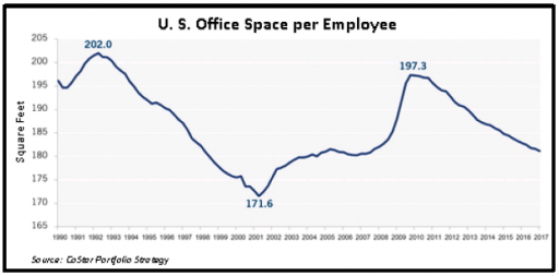 There could be a structural shift occurring in the office market, possibly driven by the rise of co-working which may be further accelerating the trend towards higher density within office buildings, maybe even past the peak density of previous cycles. While a bit dated now since we first included in back in Q3-2017, we have reproduced the graph of office space per employee nearby. The trend towards co-working and collaborative space could push the space per employee past its previous low of 171.6 square feet per person in 2001. We plan to monitor this metric closely. We are also becoming involved more directly in the co-working trend, primarily because we believe that done properly, a high quality co-working space strategically placed within an office building and run by an experienced operator will come to be viewed as a building amenity even to those tenants not directly part of the co-working environment. More on that in future reports.
Macro-Economic Conditions
Despite the creation and rise of the euro and the desires of the Chinese to elevate the global status of the yuan, the US dollar is still the world’s reserve currency and appears poised to hold that role for the foreseeable future. Because so many global transactions are cleared in dollars and in particular because many emerging countries borrow by issuing dollar denominated debt, any tightening of US monetary conditions by the Fed results in significantly tighter conditions outside the US, particularly in emerging markets. The Fed ended its quantitative easing (QE)(called money printing by some) in late 2014 and began gradually raising interest rates in December 2015. Interestingly, growth in the money supply (M2) in the European Union has 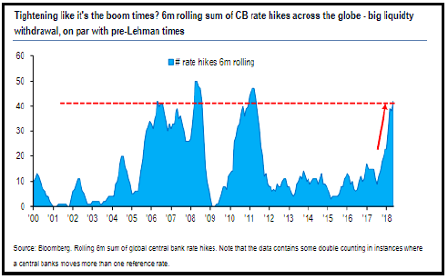 been decelerating since 2015, shortly after the Fed ended QE, which is why the European Central Bank (ECB) has been and will continue its own QE through the end of 2018. In fact, despite continuing QE in Europe and Japan, all of the major central banks around the world, the Fed, the ECB, the Bank of Japan (BOJ) and the People’s Bank of China (PBOC), are all presiding in tandem over a significant contraction in their respective monetary aggregate year-over-year growth rates. Except for the ECB and BOJ, central banks globally are raising rates, whether in response to incipient inflation, or to stabilize currencies or simply to withdraw accommodation in an attempt to normalize prior to the next downturn. The nearby chart shows the number of central bank rate hikes on a rolling six-month basis and reveals a pace of hikes not seen since just before the recession and briefly in its immediate aftermath.
These rate hikes are likely a contributing factor to decelerating monetary growth and softening economic conditions outside the US, which have disappointed so far in 2018. Even though the ECB has not raised rates, growth in Europe’s has unexpectedly slowed, and Japan experienced a contraction in Q1 despite long rates of effectively zero in Japan. China, if the numbers can be trusted, continues to grow in the 6%+ range, but that rate is down meaningfully from the average of the past decade. Even Fed Chair Powell, at the early August confab in Jackson Hole, Wyoming, sounded a note or two of uncertainty regarding the precision of the metrics and models the Fed uses to guide its decision making. Some Fed watchers interpreted Powell’s remarks as a slight turn away from the recent run of hawkishness (tightening posture). At the same time Powell made those remarks, the Fed staff released a wonkish paper warning of the lag time between changes in monetary policy and its impact on economic conditions and inflation in particular, thus weighing in on the side of vigilance against inflation. The staff paper effectively put any doveish interpretation of the Chairman’s remarks back in the bottle, and offered a straightforward counterpoint to a few FOMC members (such as St. Louis Fed President James Bullard) who continue to argue that moving more slowly, or not moving at all, on interest rates is preferable at this time.
Indeed, the majority of concern, especially from the pundits and the chattering class, still remains focused on the threat of inflation. In particular, economists are borderline paranoid about how tight the labor appears to have become in the US. In 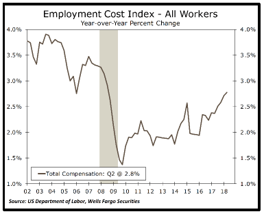 fairness to their view, the Employment Cost Index (ECI) rose in the second quarter to its highest year-over-year pace of the expansion. The ECI is probably a better gauge of wage driven inflationary pressure than the more frequently cited Average Hourly Earnings as it captures the entire cost of employment, including benefits. The ECI shows a clear upward trend in compensation costs over the past few years (nearby chart), notably more evident than the (non)trend in the hourly wage index. Importantly, total compensation growth as measured by the ECI remains below the previous cycle’s peak, which is consistent with lower levels of productivity growth and inflation.
The researchers and economists at Wells Fargo did some interesting analysis which found that while the labor markets are tight across the board for both skilled and unskilled labor, job openings relative to long term averages are actually higher for lower skill jobs than for higher skill jobs, and both measures have moved up dramatically in the past 12 months, further supporting the case made by the inflation hawks.
It is hard to know however whether data that correlates with inflation are contributing to or responding to the changes in inflation. We have postulated more than once recently that the price of oil is highly correlated to inflation and more likely a cause 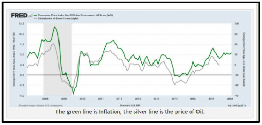 than an effect. A recent article we ran across had a graph (reproduced nearby) that certainly illustrates the correlation between oil prices and inflation. Again, it is hard to prove causality, but the political influence on the supply side of the oil market could be a clue that oil prices are more of a driver of, rather than a responder to global inflation.
Of course the root philosophy propelling the angst over inflation in the US is the dogmatic belief by a majority of economists in the Philips Curve, which postulates an inverse relationship along a curve between inflation and unemployment. We wrote probably too many words on the Philips Curve in our Q3-2017 musings and will spare readers a repeat. It was very interesting to us, however, when the Wall Street Journal ran an article on the subject earlier this summer with a fantastic graphic illustrating the growing debate over the relevance of the theory.
This illuminating graphic is reproduced nearby. In it one can clearly see evidence of the purported relationship between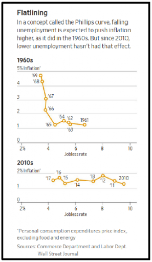 unemployment and inflation in the data from the economic expansion of the 1960’s. The curve can literally been seen in the upper chart, tracing its way from the low inflation, high unemployment conditions in 1961 pinpointed in the lower
right-hand corner of the chart, to the high inflation, low unemployment conditions late in the decade plotted in the upper left-hand corner of the chart. But look at the lower chart, which plots the data from the current US expansion. No curve! What gives? Summarizing from our previous piece, lower labor force participation rates in the US add to labor slack not picked up in the commonly reported (U3) unemployment statistics, a more open global economy brings significant external units of labor into the US economic picture, the changing demographics of an aging workforce, and the secular decline in productivity all contribute to a
breakdown in the relationship. What Powell was alluding to in his Jackson Hole speech is that the natural rate of unemployment, the rate below which inflation starts to accelerate (if there is such a rate) is hard to know, is moving in response to numerous variables, and is clearly lower in the current cycle as compared to previous cycles.
In addition to the debate about inflation, there is a drumbeat building around the notion that the higher US GDP growth rate, 4.2% for Q2 and likely headed to 3%+ for the full year, is unsustainable and will revert soon to something closer to the average of just under 2% for this recovery. (Side note: We find it amusing 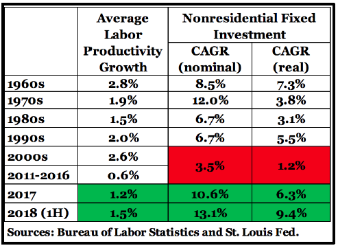 when this sentiment is expressed by someone who has just finished a sentence warning about rising inflation) Proponents of this theory of unsustainability point to the flattening yield curve and the low rates at the long end of the curve as evidence the market supports their theory. When we touched on this subject last quarter, one of the unknowns was whether the business tax cut would lead to a significant pickup in business investment and capital spending which should increase productivity. As indicated above, a secular decline in productivity is also a major element of the inflation question. As measured by the statistics for Nonresidential Fixed Investment, capital spending has indeed accelerated in the first half of 2018, and correspondingly there appears to be a slight uptick in labor productivity, both of which can be found in the nearby chart. The chart also shows how anemic capital spending and labor productivity were in the earlier part of the current recovery. If the increased rate of capital spending holds, and productivity accelerates as a result, the non-inflationary growth capacity of the US economy will improve considerably, and that would bode well for sustained growth without much threat from inflation. Effectively the benign version of why the yield curve is flat.